When scheduling isn't straightforward
Reworking the appointment template experience in CARE
- Role
- Product Design Intern
- Collaborators
- Lead Product Designer
- Associate Product Designer
- Timeline
- February – April 2026
- Organization
- Open Healthcare Network
Overview
One platform. Connected healthcare workflows.
CARE is an open-source healthcare platform developed by Open Healthcare Network (OHC), bringing essential hospital workflows together in one place. From managing patient records and clinical encounters to clinical documentation, care coordination, billing and reporting, CARE supports the different parts of delivering and managing healthcare.
Within this ecosystem, my work focused on the appointment template experience — helping hospital staff configure doctors' schedules and define appointment availability.

Many moving parts. One connected system.
Scheduling & appointments
Configure doctor availability and appointment slots
Patient records
Patient history, profile & ongoing care
Clinical encounters
OPD, inpatient & emergency workflows
Documentation & clinical notes
Structured clinical documentation
Orders, labs & pharmacy
Investigations, medications & services
Tasks & care plans
Coordinate ongoing care
Referrals
Connect care across teams
Billing & reporting
Support hospital operations
External integrations
Connect CARE with other systems and tools
The challenge
Making appointment setup easier to configure.
Appointment templates are used to define how doctors' schedules and appointment availability are organised in CARE.

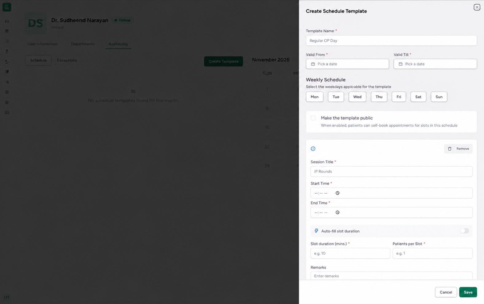
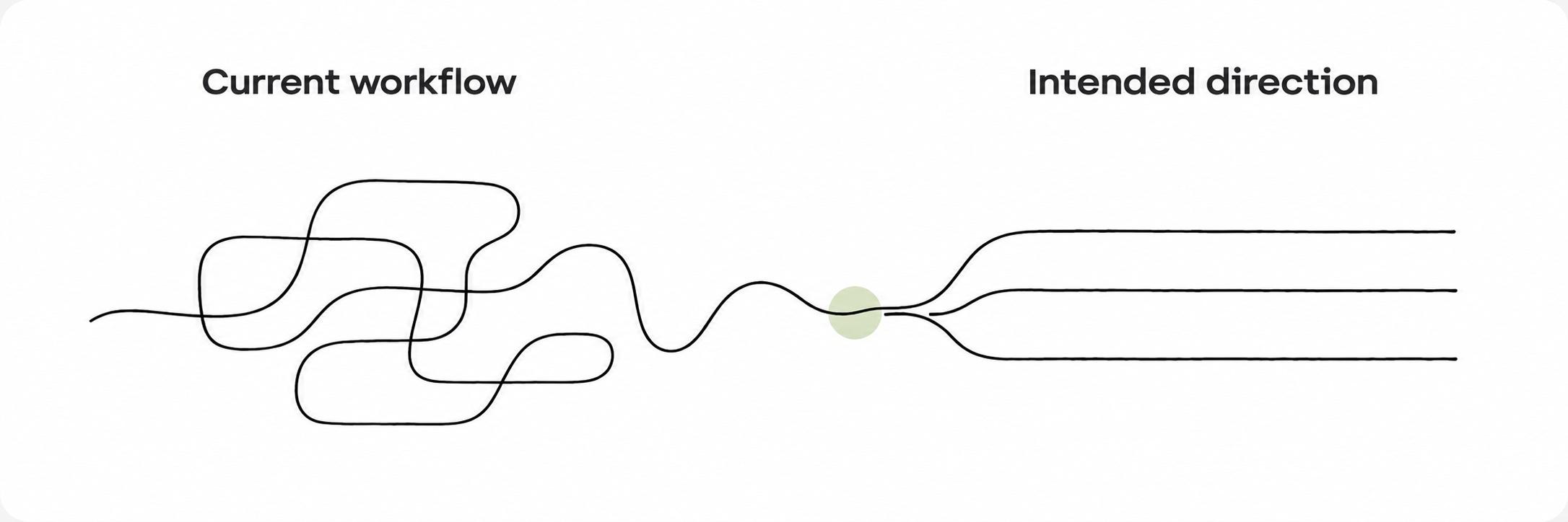
While the existing experience supported this workflow, some parts of the configuration and validation process could be clearer and more predictable. This created an opportunity to revisit the interface and rethink how staff configure schedules, manage availability and handle scheduling constraints.
My role
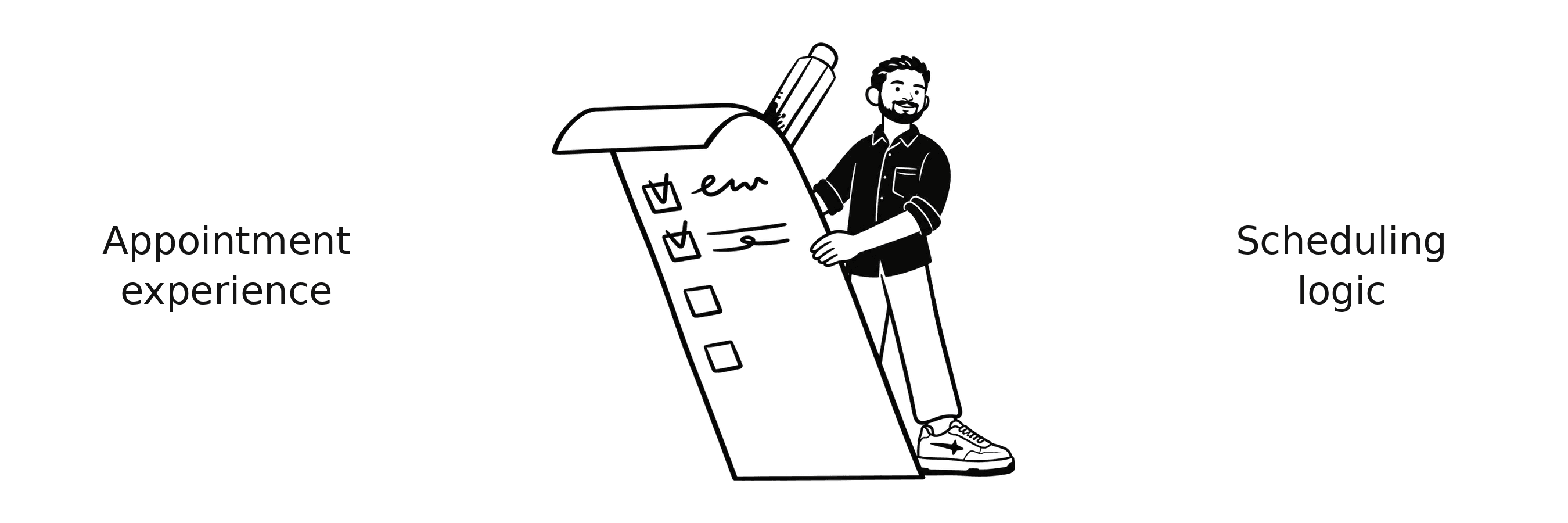
My role was to simplify the appointment setup experience!
I worked on redesigning the appointment-template interface and addressing its underlying UX issues. My focus was on making schedule configuration easier for staff, improving form interactions, and resolving issues in the validation and submission flow.

The workflow
Understanding the existing experience...
An appointment template defines when a doctor is available and how patients can book appointments. Hospital staff configure its validity period, working days and consultation sessions to organise appointment availability.
Explore the interactive form below to see how the different scheduling details are configured.
The friction
Three things made the scheduling experience harder to work with.
The existing appointment-template flow brought together several scheduling settings. Looking closely at the interactions revealed issues in how slot values were calculated, how configuration options were presented, and how errors were communicated.
The scheduling UI needed a clearer structure.
Some settings made users pause to understand their purpose. Clearer visual hierarchy and more intuitive interactions could make schedule configuration easier and more efficient.
Automatic slot calculation caused validation issues.
When the available session time was divided by the slot duration, the result could be a fraction. This triggered validation errors.
The errors didn't always point to the problem.
Errors appeared at the top of the form instead of identifying the field that needed attention, leaving users to locate the issue themselves.
The exploration
I explored ways to improve appointment setup and scheduling.

Making weekly selection quicker
Weekday, Weekend and All Days presets simplify selection, while individual day choices remain available.
Using shift hours to calculate slots.
Replacing the end-time input with whole-hour shift durations simplified slot calculation, but limited scheduling flexibility.
Making slot calculations easier to understand.
Inline guidance shows the calculated slots and time per patient, helping staff understand the scheduling outcome before saving.
Decisions
Key design decisions
The key decisions focused on making appointment settings easier to understand and improving how scheduling logic handles slot calculations.
Decision 1: Restructure the scheduling UI
I reorganised three parts of the scheduling UI to make options easier to understand and schedule configuration easier to navigate.
Weekly schedule
Decision 2: Make slot calculations work with session time
Slot options are derived from the session duration, ensuring that each available choice divides the session evenly and avoids fractional slot values.
Slot calculation
Solution
Bringing the appointment setup into one clear flow
Here is the updated appointment-template experience, bringing together the UI changes and scheduling logic.
A/B testing
Testing the redesign with real people
I ran an A/B usability test to compare the existing appointment form (A) with my redesign (B). Participants completed the same scheduling task in both versions, then shared which they preferred and where they encountered difficulties.
The results offered an early look at how the redesign performed, highlighting what felt easier and which parts still needed attention. The findings are directional, not conclusive.
Scheduling form A/B test
Each participant tried both forms. The order was randomised, so some saw Form 1 first, while others saw Form 2 first.
Form 1
Current form
—
completed the task
Form 2
Redesign
—
completed the task
Form 1: —
Form 2: —
Form 1: —
Form 2: —
Form 1: —
Form 2: —
Form 1: —
Form 2: —
Time to complete by participant
Waiting for the first responses
- Form 1
- Form 2
Which form would you prefer?
- Form 1—
- Form 2—
Results update as more participants complete the test.
Reflection
Using AI to understand the codebase
Trace backend validation errors through the code to understand their source and the logic behind them.
Working through real scheduling constraints
Explore timing and slot calculations with engineering to develop scheduling logic that accounts for practical constraints.
- Appointment Scheduling
- Workflow Design
- Healthcare UX